Tiles you can read from the sofa
Four large tiles — Live TV, Movies, Series, Catch-up — each with an icon, a title and a quiet 'last update' line. Big type, generous padding, two lines of information at most.
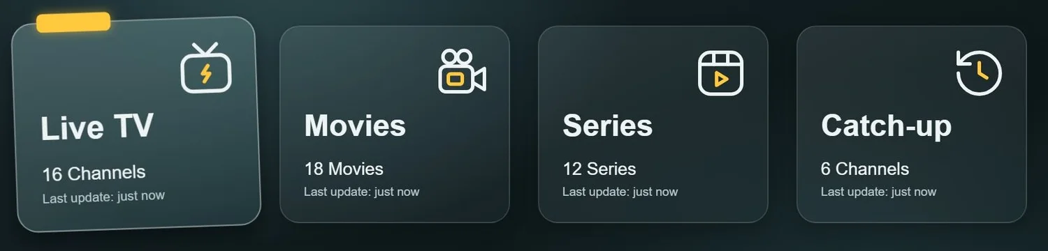
A ten-foot interface for the living room: big tiles, clear focus, nothing extra.
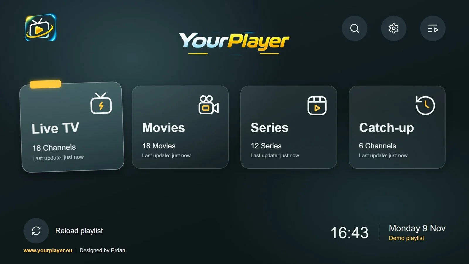
A TV is not a big phone. You sit three metres away, steer with four arrow keys and OK, and every pixel has to be legible at a glance. This is the application experience for YourPlayer: get from launch to playing as fast as possible, then disappear.
On a TV there is no pointer. Focus is the cursor, and it moves in four directions. Everything follows from that: large targets, an obvious focused state, very little on screen at once and nothing that needs precision.
The app also has to feel like part of one product. It shares its ground colour, accent and surfaces with the YourPlayer website, so pairing a TV with a phone or a computer feels like moving between rooms of the same house.
Four primary destinations as large tiles, each with an icon, a title and a quiet status line.
A lifted, tilted tile with an amber tab — readable from across a room without flashing.
One palette, one set of surfaces and one icon style across the app, the website and the product identity.
The same tiles and colours on an iPhone, an iPad and a Windows PC: two columns of tiles on a phone, one row on a wide screen, and lists you scroll with a thumb.
The way the TV, a phone and the website work together to add a playlist and unlock a licence.
The choices that shape how it looks, reads and behaves — and the reasoning behind them.
Four large tiles — Live TV, Movies, Series, Catch-up — each with an icon, a title and a quiet 'last update' line. Big type, generous padding, two lines of information at most.
The focused tile lifts, tilts slightly and picks up an amber tab. In a remote-controlled interface focus is the cursor: it has to be unmistakable from across the room, and calm enough to look at for hours.
Search, settings and playlists sit top-right as three round buttons, and the logo lockup centres the screen. Nothing competes with the tiles.

A reload action on the left; the time and the active playlist on the right. These are the two things people glance at on a TV home screen, so they are the only things down there.

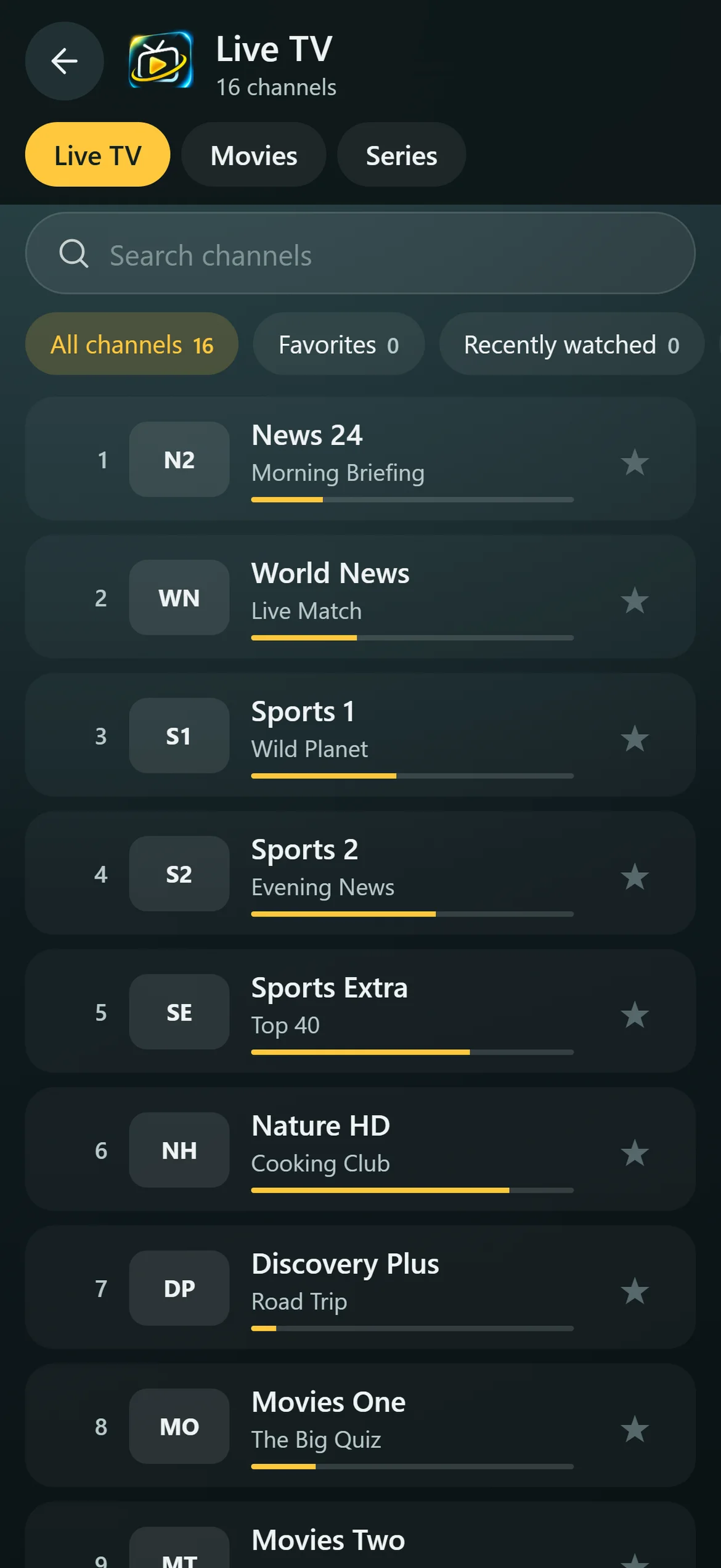
On a phone the four tiles fold into two columns and the live channels become a list with categories, favourites and search at the top. The layout changes with the screen; the tiles, the colours and the way things are named stay the same.

The same teal-black ground, amber accent and glassy rounded surfaces as the website — so the step from the TV to the site and back (via a QR code) feels like one product, not two.
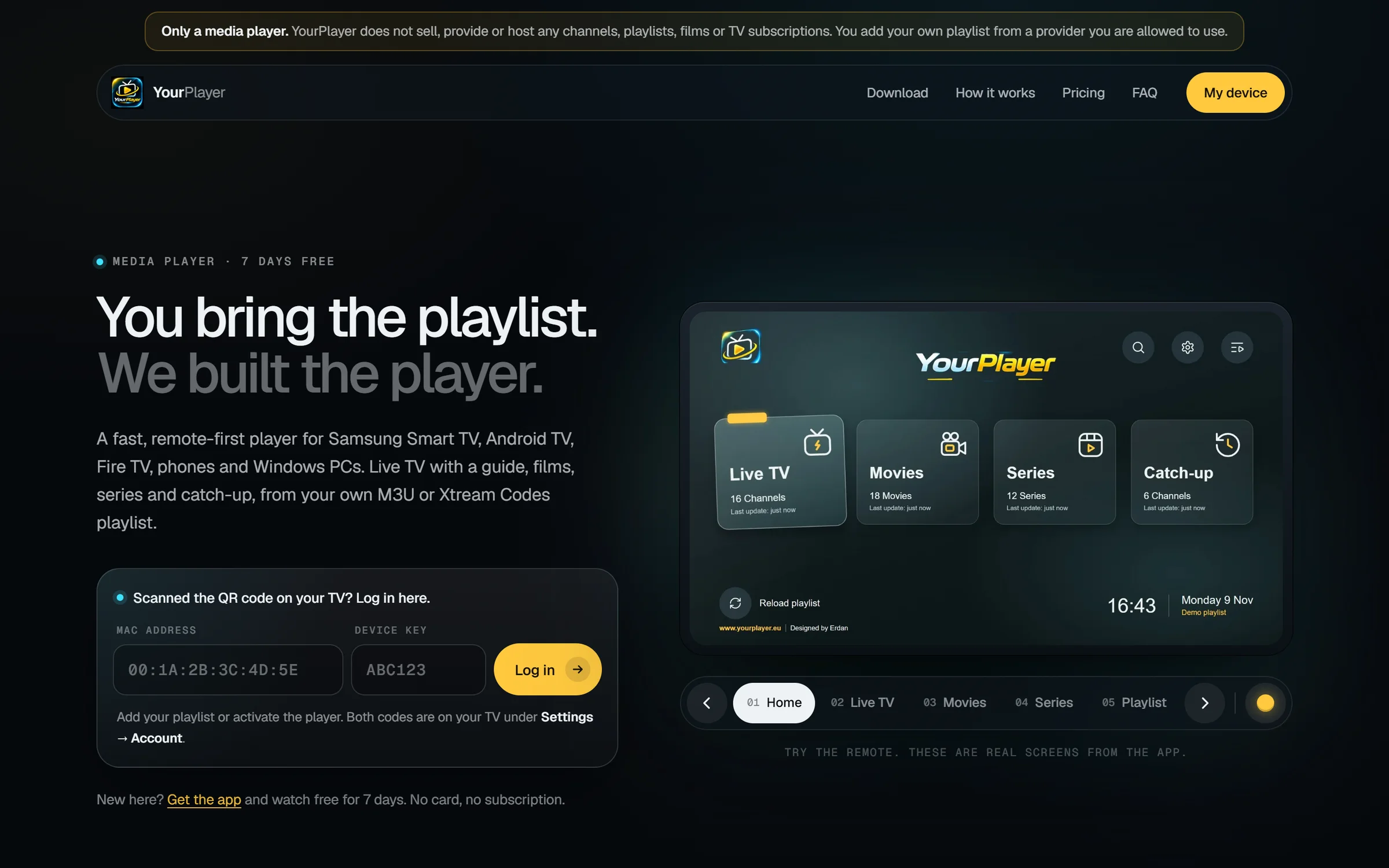
Typing a long playlist address with a remote is miserable. The experience moves that job to the device people already hold.
Install the app on the TV or Android device; the free trial starts at once.
The TV shows a QR code and the device's MAC address and key.
Scan with a phone — the website opens with the device pre-filled — and add the playlist.
The playlist appears on the TV within seconds.
When the trial ends, a QR code leads to the plans and the app unlocks.
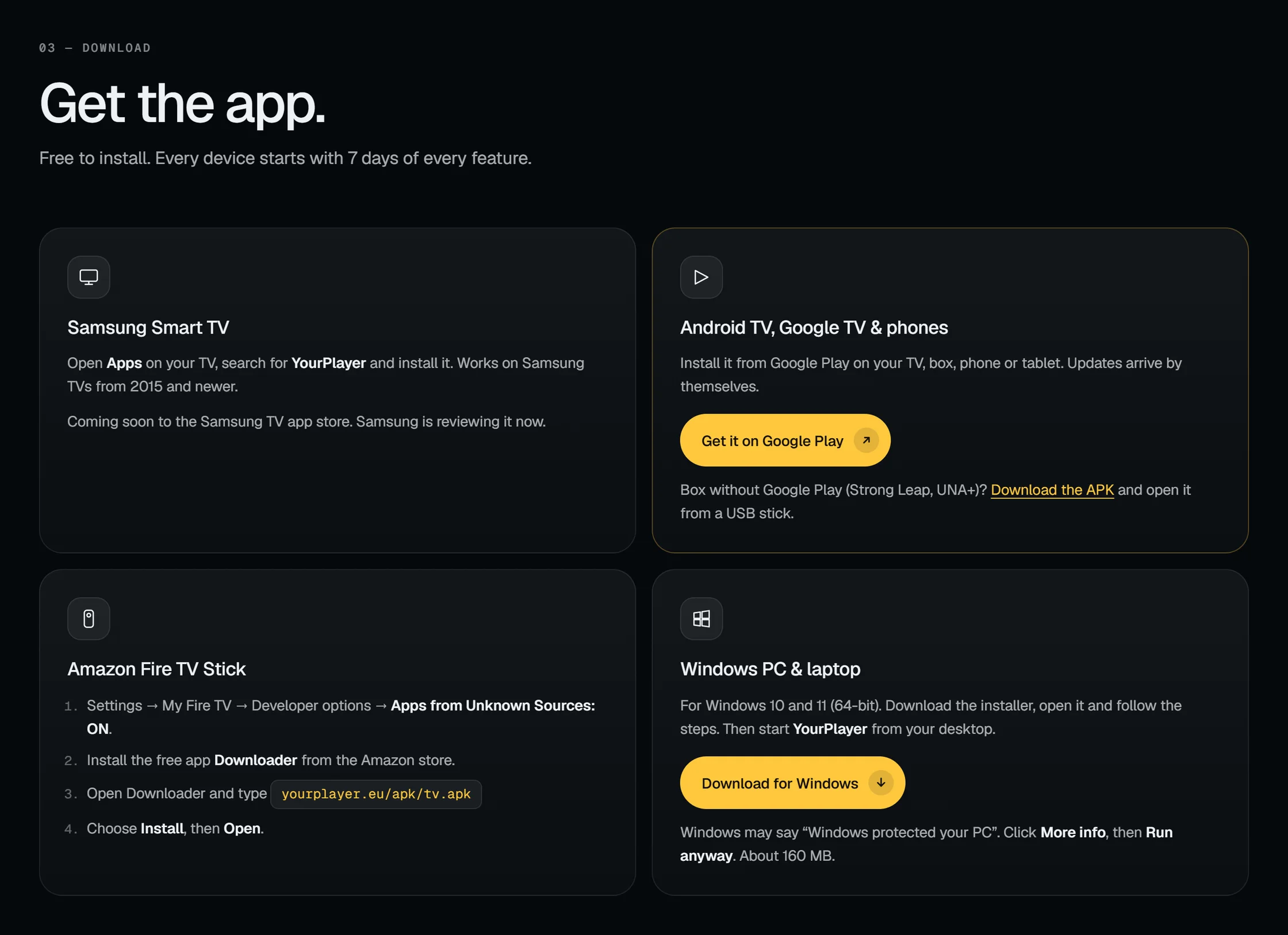
Platform status as shown on the project site.
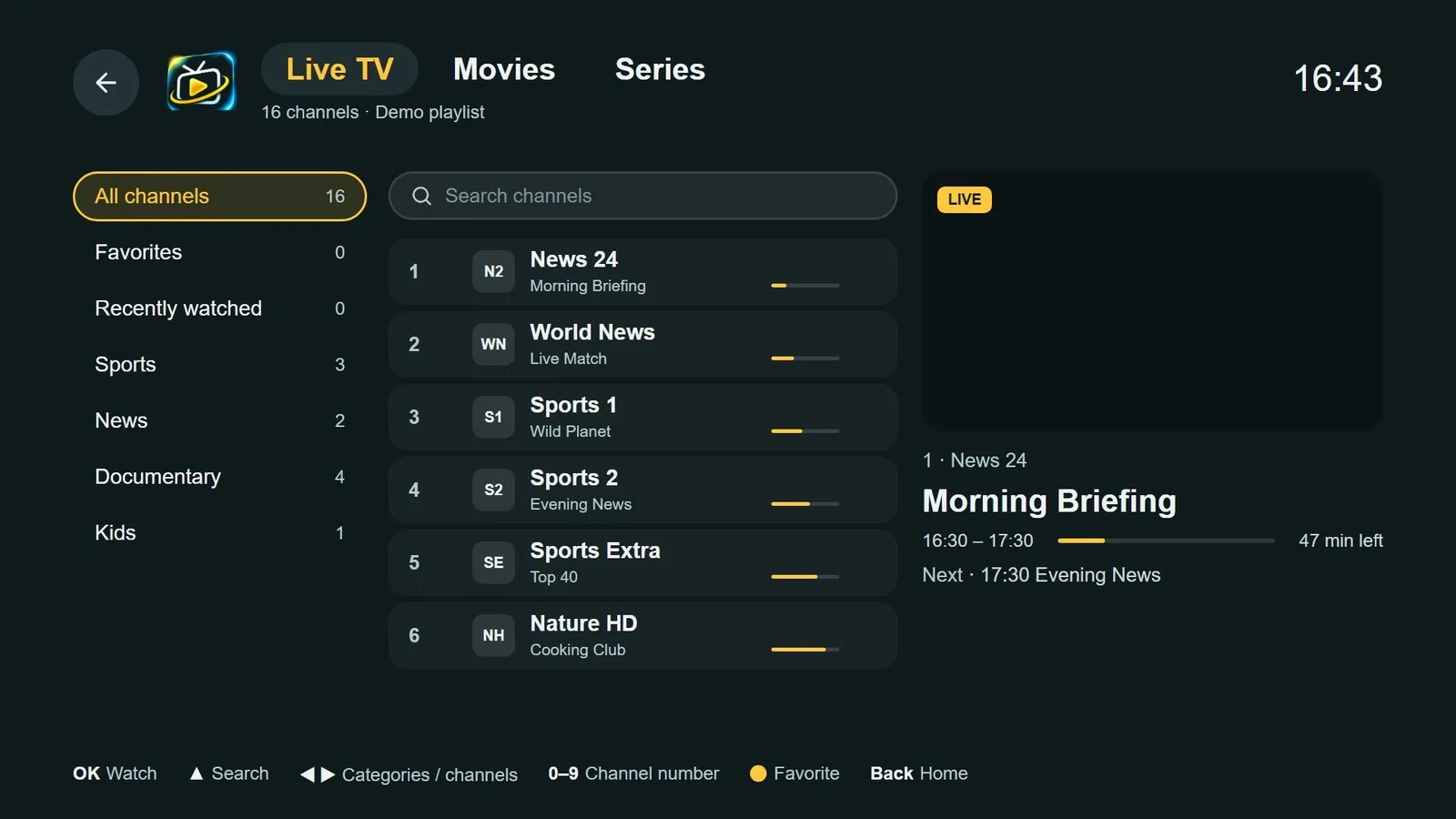
This case study documents the interface and experience layer.
Software of my own: a program for PC, tablet and phone that checks electrical diagrams against the Belgian rules while you draw.
Tell me about your project — what it is, who it is for and when you would like it live. I will reply personally.
Start a conversation